Showing posts with label pixels. Show all posts

Sunday, August 10, 2025

Petit à petit, le niveau se construit...

Bon, j'ai passé un peu de temps dans mes éditeurs sur DS ces derniers jours pour habiller un peu plus le premier niveau et je viens de construire une map avec le 2eme (après un moment de frayeur de "est-ce que je ne viens pas d'écraser mon gac.map en essayant de créer gpc.map ?_?"), tout ça pendant que je faisais la mise au point des portes du côté PC.

  • un arbre tout à gauche pour marquer le bord du niveau
    • (pour une raison inconnue, sortir de la map par la gauche conduit à un plantage de runme ... à investiguer)
  • une petite pente avant le premier arbre pour rendre le niveau moins plat, valider le graphisme des pentes et faire de la place pour des plate-formes avec les petits vers dessus (côté notuto)
    • il faut encore une palette alternative pour la terre dure et des images de bord pour la terre d'arrière-plan

I've spent some times on PC to get doors working, but also some time on the NintendoDS itself, putting more tiles around the edges of crude level I had last week. I even tried to start importing the second green zone historical map, but a blue screen in LEDS put that to an end. (possibly linked to bad handling of color palette selection in "paint" mode). It highlighted I'm lacking some darker tones for some parts of the color palette (mostly dirt) and some edge tiles for the "far away dirt"

So here's a couple of screenshots that were part of the last "Screenshot Saturday". One of them illustrating an attempt to implement the "sliding stream from waterfall" which doesn't quite work the way it should: it's too easy to force your way by quickly jumping away again and again. plus, it doesn't kick out into the water once you're at the bottom of the slope. To be investigated

  • première tentative pour la cascade-glissante
    • quelque-chose empèche le système actuel de nous jeter hors d'une pente avec les tiles "tapis-roulant" ... à creuser.
  • correction des hitbox de Bilou qui nage pour qu'il arrête de se manger les murs à tout bout de champ
  • habillage de la "cachette sous l'arbre" ... je la trouve un peu petite dans son état actuel ...
Par contre, avant la prochaine release, il faudra vraiment que je prenne le temps de dessiner une deuxième moitié au décor de fond qui convienne pour "au plus profond des cavernes sous la forêt" ...

Friday, June 27, 2025

Tomba/ponkadunk pixelstudy

"Tomba!" by Ponkadunk, published in 2019 on pixeljoint and dug by PixelProspector. A pixel art mockup of what could have been the PSX game "Tomba" if developers had not opted for polygonal textured levels instead. It's been teasing me to pixel-study it for years now, so let's give it a try. About everything in this scene is a mastery: the characters, the pick-ups, the ground ... but if you don't mind, this time I'll focus on the background and maybe the rocky ground as these are the parts in my green zone that could use some more work.


I always interpreted the background as "leaves in jungle", but if you actually go beyond the fact that it's all green, you quickly note that these are bunch of leaves here and there over a rocks background. By playing with the palette, I could spot that the greens for the rocks and the greens for the leaves are actually two distinct ramps, only sharing their darkest parts.

The rocks ramp goes from h120s66v30 to h118s79v15, with hue shifts towards h107 on the 2nd lightest shade and h123 on the second darkest. The leaves ramp goes from h93s84v33 to h103s76v20. (oh, I used a "hsv hue" layer in Gimp to tint the "rocks ramp" towards yellow so we can distinguish it better from the "leaves" ramp.

Note in the middle of the snippet that we have blade-like shapes with the rocks ramp, so likely darker leaves more than odd-shaped rocks. A reminder to not let the initial purpose of colours dictate you how you use colours when doing pixel art... not until you really have to ;)

The common darkest shade at h123s71v11 unifies the things together in a single shadow. While some elements are fully detailed over that background, other blend in and only reveal their contour with some of the darkest shades of the ramp.

The tiling of the pattern is huge -- some 164 pixels wide, which does not correspond to any hardware-friendly size, and this is no issue for a mockup.

Compared to Eagle Island or Sonic Mania background, this one has the advantage that it could fit fairly well the colour count and the memory of the "farground" in my engine.
 

Wednesday, April 30, 2025

Puddlehead splash

There's one thing I still miss in my water implementation, and that is splashes. The most beautiful waterfall will fall flat if the water pool doesn't acknowledge you've changed physics by a nice splash of pixels.

I've gathered a few references in my pixelstudies, and this one comes from
puddlehead-creations.itch.io
The video was initially intended to demonstrate how surfaces in GameMaker can be used for palette-lighting  in CinderHoodGame, but what caught my attention was those simple an efficient splashes, which I wanted to pixelstudy.

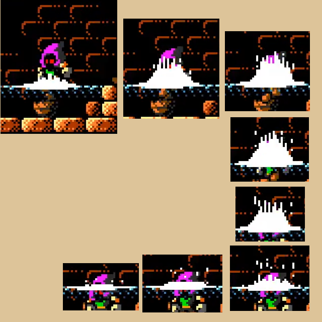
Un beau splash! Voilà ce qu'il manque à mon petit coin aquatique... Et des beaux splash, vous pensez bien que j'en ai croisé 2 ou 3 depuis que j'ai dessiné la cascade. Celui que vous voyez ici apparaît avec l'autorisation de Puddlehead Creationset a été patiemment extrait à l'aide de VLC d'une vidéo présentant un nouveau shader pour leur jeu CinderHoodGame

As often, such material is posted as a video, so I had to frame skip to get the different steps studyable. May I  call this family of splashes "noisy gaussians" ?

There are two separate animations, depending on whether you splash into the water pool or out of it. 

In both case, I'd first animate the big white part and only then add those noisy spikes and make them turn into "independent droplets" as the splash collapses.

Ne pas hésiter à faire deux animations, une pour "plouf dans l'eau" et une pour "sphlash hors de l'eau" ... partir d'une courbe en cloche d'écume blanche, ajouter des déviations pour le haut ... attendre le moment où l'eau retombe pour ajouter des goutelettes qui suivent leur chemin ... voilà ... à tester.

En comparaison, l'eau de Super Mario World fait un peu pitié ... une couleur unie, une surface statique, un splash qui recycle le nuage de poussière, selon moi ... Par contre, je note l'idée intéressante de faire apparaître au moment du splash des petites bulles qui remonteront à la surface ;)

In comparison, SMW's water is very cheap, with static line, solid blue, unconvincing splash recycling dust sprite ... but it had the good idea of spawning bubbles under you. Rayman's sprite is beautiful, but low framerate and oversized for Bilou's weight. Fury of the furries reused their particles engine but imho could use some fine-tuning... And Hydrocity used something too blast-ish.

edit: One more splashy video posted by Puddlehead creations, just in time to replace the one I used for the snapshots ^_^

Thursday, March 06, 2025

Heal Pick-up

I've had a "heal 1 point" pick-up in School Rush, and I was quite happy with it. The only issue is that everybody always mentioned it as "a 1-UP". I guess when your main character is a blue ball with hands and feet, a pick up that looks like a smiling blue ball will often be perceived as a 1-up...

I've been toying with the idea of making a "blue patch" collectible (see the bottom sprites in the screenshot nearby), inspired by the red dots of CoolSpot. I did my best but ... well... it just feels wrong when I animate it. It doesn't convey proper shape or coherent motion... and adding sparkles to it didn't help either.

Quelques petits pixels que j'ai rajoutés un peu plus tôt dans la semaine et qui serviront de points de vie pour le prochain jeu de Bilou. Pourtant j'aimais bien la balle bleue souriante utilisée pour ça dans School Rush ... mais voilà, j'entends vraiment trop souvent les joueurs en parler comme "la vie". Au point que rajouter un autre dessin pour les 1-UP, ça n'aurait pas de sens.

So I went for something else, using that same blue ball as a base, but trying to get some circling drop... it's not as smooth and convincing as I hoped, but it's doing a fair job anyway. I had tried to make something more elaborated by adding sparkles, but it feels like it doesn't work: it catch the attention along a triangle that competes with the circular motion ... or something alike. I'd love to have the wayofthepixel board to ask and get advice, but those times are gone...

J'espère que vous aimez ces espèces de gouttes-de-yin-bleues qui tournent... je pense que je les ferai sans les scintillements: ils me semblent casser la fluidité de l'animation comme ils sont là.

Ce n'était pas mon idée de départ: je m'orientais plus vers des pastilles tirées de Cool Spot, mais ça, ça s'est avéré encore moins réussi ^^".


Sunday, February 23, 2025

le nouvel arbre

Avec les tests effectués pour les-racines-auxquelles-on-s'accroche, j'en ai profité pour faire une petite capture d'écran de l'arbre tel que je suis enfin en mesure de le faire apparaître dans le jeu ... Je pense que vous ne l'aviez pas encore vu. Pas parfait, mais honnête, je dirais. (et oui, j'ai vu: il reste des caractères foireux tout autour... C'est une map de récup, si vous vous souvenez ;)

edit: ces caractères (étoiles) sont invisibles dans l'éditeur de niveaux: il s'agit d'une portion de la mémoire utilisée pour les animations qui se retrouve visible parce que la map fait toujours référence à des numéro de tiles qui ne sont plus dans mes pages.

There are tests ongoing on my devstation with Bilou hanging to a root in the greenzone. They've been behaving rather weirdly lately, but they're taking place in that recovered-vertical-level once drew to test load-level-two feature.

And that means at some point, I was bored of seeing non-sense flashy tiles at the start of every attempt, especially since I've drawn some more leaves tiles last year. But you had never seen them, because I had never used them. Well, now it's done. they're not perfect, but here they are.

Monday, February 17, 2025

pixels, at last.

Une petite heure de week-end où j'ai pris le temps de me faire des petits pixels ... enfin. Après une autre petite heure plus tôt dans le week-end pour faire quelques essais de croquis.

L'écrabouilleur, d'abord, qui est la résultante de mes esquisses basées sur Ristar, des techniques proposées par Helm que j'avais utilisées pour les livres de l'école et de la réalisation que  finalement, des gants façon Mickey donneraient sans doute mieux dans l'univers de Bilou que ma propre main.

Il se trouve que j'avais déjà tenté de dessiner ma main, et j'avais la S-Team en entier et le verdict est sans appel: le nouveu design, plus anguleux, s'intègre mieux.

Finally, I managed to find 2 hours to work on the missing pixels I need for Bilou's demo. First the smasher punch, using all the observations I made while posting about my Ristar pixel study. It's more squarish (and the S-Team girls like it), it has cartoony-4-fingers look and is modeled after a cartoony glove rather than my own hand. Quite close to the sketch I made the day before. I'm still undecided about the thumb position ...

Second, the top-of-waterjet sprite. I won't try to make a tutorial of how-to-animate it: there is very likely room for improvement, but it does a fair enough job (imho) and nicely fits the style of the jet (see below for the in-game montage ;). I'll still have to make it wave up and down and make it so that the jet pushes Bilou upstream on contact.

Deuxième morceau: le haut du geyser inspiré de GoodboyGalaxy. Il faut dire que les derniers tests se déroulaient sur une map où j'ai ajouté l'animation pour la partie verticale du jet ... et bon, voir le jet se terminer par une ligne nette comme ça, ... ça picotte aux yeux.

Je ne suis pas franchement au niveau de hot_pengu, mais je crois que ça devrait faire l'affaire malgré tout (NB, c'est plus fluide en vrai sur la DS).

Thursday, February 06, 2025

smasher pixel study

Fin janvier, je suis tombé sur un élément intéressant dans une vidéo de Ristar que je n'avais encore jamais rencontré: un gros poing sculpté dans un bloc. Intéressant parce que je n'ai pas encore de rendu convainquant pour le gros-bloc-écrabouilleur pour ma pyramide. 

J'ai commencé par le redessiner plus ou moins tel quel avant d'en déduire une version tournée vers le bas (et donc avec un autre genre d'éclairage.

You know, I'm still trying to get something convincing as big smasher for my pyramid level. And after a good deal of not-so-convincing too-realistic designs, I stumbled upon an interesting reference while watching a playthrough of Ristar. A big, closed fist, that looks cut out of a concrete block... Interesting geometry to say the least.

So after first trying to reproduce the design, I tried doing it flipped-down, with adjusted lightning to match it ... I also tried make a sort of perspective shift, observing that the lateral view is also iconic of a closed fist ... None of that has been converted to pixels yet. 

After those, (way after. This is almost necro-blogging) I eventually went into that Super Mario Wonders level with big Bowsers fists all over the place... clearly Mario Wii / WiiU fists had been an inspiration for the original design, and clearly too, the weird look of cast-hot iron won't help me giving my own art a fit-a-pyramid look ... But it shows me right now that 5-fingers fist will never look fit in Bilou's world, where things have at most 4 fingers -- Mickey-style -- when they have fingers.


Bref, c'est joli, mais même avec une permutation isométrique reprojetée, il reste un truc qui cloche ... et peut-être que malgré leurs couleurs inexploitables, les poings de Bowser viennent de me donner la réponse: dans l'univers de Bilou, un poing à 5 doigts, c'est un doigt de trop.

On va donc reprendre le cours de Helm (maintenant qu'il est en ligne ^^), une série de gants de Mickey Mouse et essayer de se construire un gros poing bien lourd et bien bilouteux pour faire du jus d'intrus dans cette fameuse pyramide ...

Et non, ce n'est absolument pas un point prioritaire sur aucun des non-plannings ... donc ... on le fait en moins de 15 jours ^^"

Tuesday, February 04, 2025

back then ... geometry first.

Dumblador revisit post from October 2011 featured not-so-great book covers and "colour balance" post 20 days later featured them almost identical. Then 10 more days and they suddenly look like in School Rush. What happened in between ? pixel art Comment and Critique. "I think you're focusing way too much on using techniques right rather than the objects itself" said Elk, but I couldn't figure out what that meant. "The biggest problem with your art is bad texturing, at this point, I'll return with specific edit and critique." So Helm Returns is what happened. 

En triant un peu, je suis retombé sur un post du forum pixelation qui répond à une question que personne ne se posait. C'est qu'entre le relookage de Dumblador (Oct. 2011) et la recherche des couleurs idéales pour la School Zone (Nov. 2011), on est passé d'un livre pas très convaincant au design actuel utilisé dans School Rush (et qui restera certainement inchangé pour Dreamland). Dans ce post, Helm me donnait une série de conseils en retouchant lui-même le livre que j'avais dessiné.

1. is your book.
2. is the form broken down to its block shape.
3. is geometry, lit from above more or less. If a thing doesn't look good and identifiable on this stage, it won't look much better if you overrender it.
4. here I apply more detailed geometry, I still don't need more colors or fancy tricks, I don't need to fake texture, it's just stuff that the book can support. I also looked at reference here which you should always do, no matter how cartoony what you're trying to draw is. You can spot many differences from 3 to 4 that are related to the reference.
5.After the shapes are good, identifiable and the object has volume, you can go nuts with your new school colors and tints and whatever else, it's all embellishment from here and on.

Le jeu, dans ce cas-là, c'est d'essayer de réappliquer soi-même les conseils qu'on a reçu. A savoir ici "commence par la forme brute, puis fais en sorte que la géométrie soit compréhensible". Ne pas aller au-delà de l'étape 3 si quelque-chose va de travers. Ensuite, rafiner la géométrie mais ne pas texturer, ne pas partir dans des grands effets de couleur. Une excellente leçon, et je vais en avoir bien besoin pour m'attaquer au gros poing pour la pyramide ...

So I went on and try to apply the master's suggestions to get closer to what I wanted:

My attempt at having the right geometry with flat shading and minimal details, my step of putting more detailed geometry and shading before adding any texture, and the final take. The page lines have become too horizontal and dull, retrospectively, but the binding has been used almost as-is in the game.

It was a pleasure to read the master's comment:

Much, much better. Wouldn't surprise me to see this piece in any professional good looking mega drive game of the era.

Approach all real-life related items you render in a similar way, avoid 'noisy textures' for their own sakes and you will level up in your craft."

A lesson to remember as I'll have to work on more pixels for the upcoming game...

Saturday, January 18, 2025

Hydrocity pixel waterjets

Bin ça! Il y avait un parfait exemple de jet d'eau dans un jeu 16-bit dans la série Sonic, et j'étais complètement passé à côté! Heureusement qu'il y avait Tim pour poster une photo de son Anbernic Arc-S pour me remettre sur le droit chemin!

L'effet est plutôt convainquant, plutôt utilisé comme script de transition/narration entre 2 phases que véritablement comme un élément de gameplay interactif, mais ça reste pertinent. Il reste un peu moins de 2 secondes à l'écran avant que Sonic ne soit propulsé plus haut tandis que le jet redescend et sort du cadre.

Last year, I was looking for 16-bit references of a water jet and I couldn't find anything satisfying, but it seems like I completely missed those location-transition-events in Hydrocity Zone act 1 of Sonic 3. I hope you'll excuse me: my memories of Hydrocity essentially resume to "this place hates me". Trying to keep enough air in Labyrinth Zone wasn't easy, but it felt possible and a sort of appropriate final challenge in the game. You'll completely miss the water jets if you're watching a speedrun or any competent player as well: they're sole purpose is to bring back upwards player who failed to stay on the high dry path.

ça se passe dans Hydrocity, la deuxième et parfaitement imbuvable zone de Sonic 3. Il se trouve que j'ai le jeu sur une cartouche combo Sonic Genesis 2D pour NDS et j'ai donc fait l'effort de retourner jusque dans Hydrocity, mais sans encore arriver jusqu'au jet vertical pour me rendre compte par moi-même.

Il faudra pour ça, une fois le jet horizontal passé, que je m'aventure dans les profondeurs jusqu'au couloir avec les hélices qui nous poussent vers la droite. ça malgré les pics, les poissons mal foutu et les tapis qui nous ramènent en arrière juste quand on est sur le point de pouvoir reprendre de l'air ... C'est beau le rétro, mais là, c'est quand même pas loin de l'abus vu qu'on est encore qu'au 3eme stage du jeu ... 

For the era, they seem to work surprisingly well. They only need 4-colors palette cycling, and are even somewhat light on tiles consumption, with a 32x32 pixels pattern (plus mirroring) for the trunk and 32x48 for the top (and even one 16x16 block of the top being shared with the trunk). You've got one big arc per pattern, which clearly works better than the repeated pattern of Mc Donald's Treasure Land Adventure. (although, this is not the worst water animation in that game ...). Note too how the top part uses the raster in opposite direction so that it feels that water is falling down there. (yeah, obvious, I know)

Bon, mais trève de rouspétances, regardons ces pixels. l'artiste s'est concentré sur un motif d'arc répété avec un dégradé plein de tramage (plutôt une bonne idée sur la technologie CRT de l'époque) pour finir par un arc de cercle plus arrondi où le dégradé est mis à contre-sens.

Le tout est évidemment animé par palette cycling ... ça vaut mieux vu la surface à prendre en compte. A noter aussi la grandeur du motif. On a pas essayé ici de faire de petites vagues répétées: la partie "champignon" est constituée d'un seul dégradé ! Du coup, c'est bien l'effet "mouvement" qui prévaut sur l'effet "clignottement".

The pattern is rather noisy, but that shouldn't be a big issue for the CRT screens it is designed to. Given the size of each area, the motion illusion prevails over the flashiness. At least when played at 75% of the intended 60fps. Maybe it also worked at 60fps on CRT screens (we had 50Hz here, so who knows ...). 

All I can tell you is that it took me dedication to bring Sonic in the proper spot(s) of Hydrocity on my Sega collection for Nintendo DS cartridge and on the 3DS LCD screen the result was ... meh ... mostly getting a averaged blue tint all over the jet, the pixels staying in place for most of the 2 seconds where we see the jet, with my brain saying "ah! I spot the pattern!" rather than "wah! That's blasting fast!".

So well, it was a nice reference at the time. I mostly works because you're taken off-screen once the jet should retract and because it's a one-time event rather than what I need (a trigger-on-demand event) or what Mc Donalds and Bubsy games needed: an platform going up and down continuously.

J'affronte donc une deuxième fois le niveau, fort de la carte mémorisée ... il y a surtout des zig-zag imposés à toute allure entre les deux jets d'eau du niveau 1 (aucun dans le niveau 2, qui a besoin de ces tiles-là pour nous mettre plus de toboggans). Je peste contre les poissons-pirhaña qui m'empêchent de sauter pendant plusieurs secondes alors que les bulles d'air ne sont suffisamment grande pour respirer qu'à partir d'un sonic du sol ... je choppe un bouclier-bulle ... je le perd ... je suis propulsé une 2eme fois.

Eh bin, les gars, l'effet "mouvement", à 60fps sur un écran LCD, il est un peu perdu dans la bagarre ... on voit juste une trombe bleue d'une couleur plus ou moins uniforme tellement ça va vite. Un peu déçu, je vous l'avoue.

Friday, May 31, 2024

Unity Pixels

Cyangmou posted again a picture that reminds me of why I wasn't appealed by Unity development (before Unity started acting crazy with its Terms of Use): how to set up unity camera for pixel art

- pick orthographic lens size

- compute lens size = desired pixel resolution height / (2* pixels per unit)

- there are by default 100 PPU, but you can tweak that to another value to support 32x32 or 16x16 blocks rather than blocks of 100x100 pixels.

Oh. Of course that was before Unity lost everyone's confidence in the indie game scene by announcing developers would have to pay a fee per deployment of their game while many indie developers built their business model on the fact that unity license was free and thus game themselves could be cheap enough so that people would actually try them. There's not a chance I get into Unity today, not even when I know that some studios would have an easier time publishing my game on the Switch if it was made with Unity.

Saturday, May 04, 2024

Goodboy('s geyser) was here

J'ai quand-même commencé à tenter de dessiner un jet d'eau. J'avais lancé un appel sur twitter, pour essayer de trouver des références. Il faut dire que les cascades de l'époque 16-bit étaient encore plus convainquantes que les jets d'eau de la même période.

J'ai eu une réponse en or, du genre de celles que j'ai eues pour les arbres l'an dernier. Le temps de faire le point, et je vous raconte tout ça ;)

"I can't draw convincing water jet from below" did not sound like a very convincing reason for not using a water jet if it is the proper game mechanic to use. I finally have a good one to pixel study and started doing my own, as you can see on the photo, but allow me to rewind and start where it started.

Un pas en arrière pour revenir à l'époque 16-bit. On préférait souvent éviter d'avoir de trop grosses animations à gérer sur ce genre de machine, et animer de l'eau se faisait généralement avec un dégradé et une modification cyclique sur la palette de couleur (palette cycling). Le foncé devient blanc pendant que le clair devient foncé, le très clair devient clair et le blanc devient très clair...

Back in the 16-bit era, it was frequent to do color cycling to animate a waterfall. Sometimes it worked nicely, sometimes it was so-so. It works best if the raster is long enough and if the animation speed remains movie-quality. At cartoon-12fps, you start seeing as flashing more than falling down water.

But you'll note the bottom of the waterfall is often missing in those scenes. And when you look at the few game art that tried having upwards water jet, you understand why: it no longer works. We expect water to become darker with density increase. In a waterfall, vertical density variation are interpreted as downwards waves, but when water eventually widens up in a fountain-like mushroom cap, it is always more dense at the center and less dense on the "edges". If you do palette-cycling here, you break that.

ça donne une illusion potable de cascade, pourvu qu'elle ne soit pas trop grande et que la vitesse d'animation soit réglée au millipoil. Et si possible, utilisez plus que 4 couleurs pour le cycle, parce que sinon on se retrouve avec quelque-chose comme le décor de Yoshi's Island qui tient plus du clignotement que de l'écoulement d'eau. 

Et malheureusement, la même stratégie est appliquée dans les (nettement plus) rares jets d'eau de l'époque. Je dis "malheureusement" parce que pour un jet d'eau, on va forcément devoir aussi animer le "chapeau de champignon" qui va avec, pour lequel la surface animée est encore plus grande. Et l'effet clignotement encore amplifié. On l'a déjà dans Bubsy, où les pixels isolés clignotants ne parviendront pas à faire oublier le fait qu'ils sont statiques. On l'a dans le final de Link's Awakening et dans le jet d'eau d'un jeu obscur avec la mascotte du Mac Do.

In Bubsy, for instance, the artist sprayed out the water pixels as the water starts falling down. This is coherent with the style, but animating them will just give you blinking static pixels of water. And the stylized 'mushroom cap' used in Link's Awakening and Mac Do game flashes even more aggressively.

Là où ça coince tout particulièrement avec le "champignon", même quand on évite les pixels statiques, c'est qu'avec ce type d'image, le clair et le foncé ne sont plus interchangeables. On voudrait que le bord soit plus clair parce que l'eau y est plus éparpillée. Faites-y du palette-cycling et vous aurez des images qui donnent l'impression d'être en négatif.

J'avoue que je trouve un peu dommage qu'avec les resources graphiques de la SNES, on en soit réduit à ça pour animer l'eau. Mais il faut reconnaître qu'en misant tout sur de la RAM vidéo, la console n'a plus la possibilité de reprogrammer les plages d'adresses (bank switching) pour faire des "animations gratuites" comme la génération 8-bit. Toute animation va impliquer un transfert DMA vers cette VRAM et le budget pour ces transferts est limité (comme toujours).

Truly, the "cap" of the fountain/geyser needs dedicated animated tiles, but we're unlikely to see that on 16-bit engines. 8-bit machines could have done that with more ROM and evolved mapper chip, but 16-bit consoles no longer try to pull pixels directly from the ROM. They put them in dedicated video RAM, and rely on DMA channels to bring animation frames in due time. But the amount of pixels you can transfer per frame is limited. Animating Bubsy's geyser that way at 60fps would consume 25% of your animation power:

On NTSC with overscan mode turned off, there are 262 - 224 = 38 scanlines in vblank. Subtract one scanline for prerender time, and you may end up with 165.5 * 37 = a smidge under 6 KiB per vblank.

6K, sur SNES, c'est 46 blocs-question de Super Mario World. Animer quelque-chose de la taille de la fontaine de Bubsy à 60fps, ça demanderait donc 1/4 de la puissance dans la partie critique du moteur de jeu.

Bon, et après l'époque 16-bit, alors ? Du côté de Super Princess Peach, par exemple, qui est plutôt réussi côté pixel art ? Un jeu ou pleurer est une mécanique de jeu, il doit bien y avoir des jets d'eau dedans non ? 

So, well, my game is not for a 16-bit system anyway, so could there be any water jet pixel art for 32+ game that I could study instead ? Say, in Super Princess Peach ? A game where you cry waterjets sure should also have some geyser-like elements, right ?

Well, it does indeed, in Wavy Beach 2. It uses a "cone" of water that might be animated through color cycling plus a "flower" top that follows the rule "keep the center dark and the edges light". But even then, I don't find it appealing, and I don't see how I could make it match anything but the super-stylized environment of SPP.

Eh bien oui, en effet. Dans le niveau 2 de la plage. Mais je dois bien avouer que je ne suis que moyennement emballé par le style. On a un premier élément (le cône) qui utilise un effet de palette qui ne fonctionne pas trop mal, les traîts latéraux restant sombres en permanence. Puis on a cette "fleur" qui grandit et rétrécit, gardant toujours le sombre au centre et se permettant des éclaboussures au bord des "pétales" sur la dernière frame.

Mais ... bof. Même en corrigeant le truc pour que la princesse apparaisse par-devant la fleur, ça ne me convainc pas. Oh, ça marche plutôt bien avec le reste de l'esthétique stylisée de SPP, mais ce type d'animation dans Bilou ? Pas convaincu.

Et depuis ? Parce que bon, le modèle pour la cascade de Bilou, il ne date pas de 2005. Mais le truc, c'est que j'ai surveillé les cascades en pixel art pendant pas mal d'année, sachant que j'en aurais besoin tôt ou tard. Alors que des geysers, c'est plutôt un truc de dernière minute.

Et c'est là que hot_pengu, l'auteur de Goodboy Galaxy, m'a pointé vers la vidéo de son jeu sur GBA

And so I finally asked hints to people on twitter who might have seen something I could use as a reference, or ever proper keywords to search for one, and to my surprise, I received an answer from indie game developer hot_pengu:

We call it a 'geyser' internally for goodboy, and this (timestamped vid) is how we represent it.

Je jette un oeil, je prends un petit screenshot pas fou mais qui pourrait donner un point de départ, et là,

Here's a better look, if it's useful! (there's two versions, one comes out of a monster)

He added as I posted a quick snapshot for future pixel study, handing the Goodboy Galaxy spritesheet with 2 sizes of exactly-what-I-needed material that you see printed on the top photo. 6-frame stunning animations, with tileable base and stylish top. Even the style isn't that different from the one I have for my waterfall!

Une animation pixel-art moderne, tout en fluidité et utilisant bien les 6 frames, qui peut être étirée en hauteur comme on veut ! C'est celle que vous avez vu tout en haut de cet article, imprimée et que je suis occupé à étudier. Parce que là, j'ai bien mieux qu'une référence pour donner une seconde chance au cas du bouchon: j'ai une idée.

Voyez, ce geyser, je peux le placer au fond du trou, directement, sans avoir besoin de bouchon. Il bouge, il attire l'attention. Pas moyen que le joueur ignore sa présence. Il a un look quelque-part entre la plate-forme et le bumper ... on pourrait toujours sauter dessus, on ne sait jamais. 

I like how it simply requires the player to hop into the proper spot to trigger. Much cleaner gameplay than the "pull the cover" I had thought about, but it remains interactive. Plus, by being already flowing before we interact, there's no more questions about "where does this water comes from, where does it goes afterwards", etc.

Deuxième bon point, une fois que Bilou a sauté dessus, je peux réutiliser le type de comportement que le joueur rencontrera plus tard avec Inkjet: Bilou reste "coincé", la pression s'accumule et wouf! on est projeté vers le haut.

And that would match the way 'inkjet' monsters will lately be used as delayed bumpers in the School Zone ... Since this game will no longer feature a welcome screen with the inkjet, it's a good thing the player can be shown early what happens after the "caught in a boiling pot" animation.

Et si il a raté son premier saut, il peut retomber sur le "chapeau" du geyser et re-sauter de là.

Mieux encore: si le joueur n'est pas resté dans le geyser jusqu'à être projeté, on peut le pousser vers le haut s'il entre en contact avec le "pied" du geyser. Et si rien de tout ça ne se produit, on peut directement réessayer la même manipulation. Pas de risque d'aller se coincer en nageant, de faire redescendre l'eau trop tôt ou quoi que ce soit de ce genre.

Bref, j'avais pensé vous redessiner *mon* geyser sur DS pendant la petite semaine de vacances, mais au final, j'ai juste eu le temps de faire une petite feuille de notes pour illustrer ce que j'imagine comme mécanique avec mon geyser ... parce que les vacances d'une famille 11 + 15, ça ne ressemble pas vraiment à la dynamique 8 + 12 et ses plaines de jeu à surveiller :-P

I expect that the platform-look of the geyser top will invite even the younger players to jump on. I expect that its animation will catch their attention much more than a purple block or handle. Should they fail to use the bump effect to reach the key, they can be caught by the platform-top and jump again. If they jumped out before the geyser happened, they can jump into the flowing geyser and be pushed up to the platform-top. It's flawless ^_^

Now I just need to find enough time in the upcoming evenings to complete it ^^"

PS: if you want to animate something like that, consider animating it without the vertical motion first: just the wobbles and the sparkles, and only then apply the vertical shift to each frame. Unsure I will follow that advice myself this time.

Friday, February 16, 2024

Sand "waves" completed.

Bien. Ce coup-ci, je pense qu'on y est enfin. Le sable tombe, il fait un petit tas, le tas croule le long de la pente, puis se "dissout" au moment d'arriver à la chute suivante. ça reste "mode démo", celà dit: le code pour la pente à contresens n'a pas été testé et la longueur de la pente est hard-codée dans la "l'animation" de la vague qui descend. Mais ça fera l'affaire.

At last. Sands falls down, piles up, flows down slope and then falls again. The illusion is complete. The code is partly production-grade, partly demoshow-grade. Just what I need for a new release of the 3-rooms demo ... if only there wasn't that just-popping-up bug in the School room >_<

Friday, February 09, 2024

Sand falls

Il faut bien l'admettre, dans toutes ces animations de Bilou qui est repoussé par les chutes de sables et de décor en pseudo-3D réalisé à grand coup de HDMA, la chute de sable tout en pixels statiques, ça ne rendait pas particulièrement convainquant. C'est donc maintenant ma dernière étape avant une petite riliize de ma démo 3-écrans.

Anokolisa mock up, initial reference

Almost every time I posted a video about Bilou being pushed by sandy slopes or about the pyramid background 3D scrolling, I couldn't help being sorry for the flat, uninspired, unanimated sands fall that are present since the first release of the 'three rooms' demo. That's the last thing I want to fix before I release a new one.

ça fait un moment que j'avais ce mockup d'Anokolisa parmi mes images à étudier et j'avais même quelques gribouilles assez réussies de comment ils étaient construits ... mais vous en conviendrez, du miel et du sable, ça ne s'écoule pas granchement de la même manière.

J'ai fini par retourner regarder les graphismes de la Sandopolis Zone dans Sonic & Knuckles ... qui au final étaient assez simples de ce côté-là: un cycle de 4 couleurs dans la palette, un tramage par-ci, une rangée de pixels transparents par là ... j'ai essayé de m'en inspirer et ça rend assez correctement pour une première démo, je trouve. Il me reste encore à animer 'le sable qui descend le long de la pente'. Voyons si le week-end m'offre le temps de faire ça ;)

But it is a bit tricky to find good pixelart reference for such item. For quite some time, I thought I could use something inspired by Anokolisa's Hive tileset, until I realised that it would never flow like sand, no matter how close I could get from that brilliant design. Neither Souldiers nor Megaman could help, but I finally remembered about Sonic's Sandopolis Zone, burried in early reference hunts. A quick check on youtube convinced me that, once in motion, they are good looking. Their design is quite simple, though: wavy patterns of 4 colours that will be palette-cycled. When they have to become half-transparent, non-solid tiles, they are alternated with empty columns or dithered with transparent pixels. That's enough for a CRT screen, but I will likely require something a bit more subtle for the LCD screen of the Nintendo DS. Well, my pattern is more angled, but it seems to be good-looking enough, given mastodon reaction.

Now I have to aslo animate the slope itself, but checking Souldiers again, I believe I might better spawn waves periodically and let them roll down a static ground than trying to animate it all as I did for the sand falls (scoop: I'm not using palette cycling this time)


Saturday, September 02, 2023

Le dessus des arbres

Je commence à avoir une assez imposante collection d'arbres à analyser dans mes #pixelstudy, et il faudra probablement que j'ai quelque-chose de satisfaisant à dessiner pour la partie supérieure des arbres dans Bilou Dream Land... analysons donc.

Et commençons par un mockup de SnakePixel (owlboy) qui nous réinterprète pour "16-bits" l'Amazonie de Duck Tales. Avec des branches où les feuilles sont distinguées les unes des autres et une palette assez généreuse de 6 à 7 tons de verts pour chaque plan. L'arbre à un look "tileset" avec ce bloc de 64x56 (encadré) qui répété sur une même horizontale. Un autre bloc 64x? est utilisé pour les lignes au-dessus. Un bloc de 128x64 est utilisé pour la jonction avec le tronc. Je ne pousse pas plus loin, parce que plusieurs pixels remarqués ça et là me laissent croire que l'auteur n'a jamais essayé que ça tienne *vraiment* dans les 64K de VRAM de SuperNES.

One part of the current 'green zone' tileset displease me, and that is the top-of-tree tiles. I collected a few more reference pictures of trees (possibly with the canopy part visible) and since I'm sick this week-end, it seems like a good time to finally pixel-study them. Let's start with SnakePixel's mock up of Duck Tales Amazonia level, with a generous 6-7 tones of green per tile, and palette variation depending on the plane we're seeing. His trees canopy on the foreground are mostly made of 64xalmost-64 blocks repeated horizontally, but with another kind of blocks as you move up or down in the tree. Leaves are cleanly separated from each otther, although not outlined. I spot a dedicated 128x64 area for the leaves-to-trunk transition, but also lots of little details at the edges of 'common' blocks that suggest the author was more drawing inspiration from 16-bit limitation than really trying to work within them.

Un autre arbre qui m'avait tapé dans l'oeil, c'est celui d'Alwa's Legacy, dessiné par Vierbit pour le jeu de MikaelForslind. Le style est assez particulier, surtout pour la partie la plus haute de l'arbre (qui arrive assez peu souvent à l'écran, comme on peut le voir dans mon screenshot ^^".Il y a pas mal de zones "plates" de couleur unie bordée par des feuilles très larges, au design simple mais nettement détaillées. Pas de tentative de coller à un tileset réduit, mais on note clairement des réutilisations de certains motifs, soit tels quels, soit retournés, soit avec une autre teinte.

Let's move to another tree. One that really did it into a game (and which actually made me buy the game :P) : the big garden tree of Alwa's Legacy drawn by Vierbit. I've been lucky enough that the game author Mikael Forslind offered me a copy of the original in-game trees layer for detailed study. A true gem, since I feel like this style of tree would be perfectly capable of hosting some actual gameplay, with some leaves-platforms, but also some vine-ish things to hang on. At first I was surprised that it was even possible: we seem to see the tree mostly 'from below' here, except that we also see it up to the top, which seems incoherent. Except if the tree's canopy is not pointing at the zenith, but is bending towards the rear of the scene.

Et très sympatiquement, Mikael m'a envoyé le layer tel qu'il est utilisé dans le jeu, avec les deux arbres entiers et les rivières qui les séparent. On remarque que sur le haut de l'arbre, on a des feuilles plus ou moins nettes selon qu'elles sont à l'avant où à l'arrière, pouvant aller jusqu'à de simples silhouettes de feuillages superposées.
Autre élément remarquable avec cet arbre, c'est la quantité de "feuillage intérieur" qu'il nous dévoile. Vous savez, ces zones sombres ou seule une courbe de feuilles apparaît ça et là dans les branchages.

On a more macroscopic scale, it is surprising to see that mix of highly-detailed, very large leaves (with the brightest color) while some other part of the tree just use a flat color with some leave-shapes outline. Interesting to see that, while the tree has obviously not been made to fit a tiled grid, Vierbit clearly did reuse some bunch of leaves at different places, sometimes flipping them, sometimes applying a color swap.

The inner, dark area has only silhouetto of leaves, with the exception of hanging vine-styles ropes of leaves. That makes composition of the structure more free, with the extra bonus that we usually don't have to show branches to far away from the trunk because they eventually disappear into dark leaves before reaching any place where we'd have to show them too thin or mixing realistically with detailed leaves.

Les feuilles n'y sont qu'esquissées, sauf dans le cas des guirlandes de lianes qui dégoulinent des branches, .. et qui m'inspirent pas mal au niveau gameplay si je parviens à ajouter les mécaniques qui m'intéressent dans le nouveau jeu.

Les branches, aussi peuvent se permettre d'aller un peu dans le sens qu'on veut, et elles n'ont pas nécessairement besoin de se dirriger vers une partie spécifique du feuillage, puisqu'elles finiront masquées avant d'atteindre le state de brindilles.

Alors j'avoue qu'au départ, cette perspective m'a surpris. "Mais? on ne voit jamais un arbre sous cet angle !?" Eh bien, à mieux y réfléchir, si: si son tronc est penché vers le fond de la scène et que son feuillage est donc majoritairement plus loin du plan vertical où se trouve la base de son tronc. Si ça permet de mélanger art et gameplay, ça me va tout à fait.

Another set of tree tops that made me buy a switch game was those of Eagle Island. I seem to see the construction pattern, here: draw arcs, then cover them with leaves. Colors within an arc are mostly identical. Each leave is its own cluster, making it distinguishable from the others but without any per-leaf shading or texture. I wonder whether something alike could be used for Bilou. I dig the color choice a lot, though.

Je remets aussi pour le coup le haut des arbres de Eagle Island, principalement construit de feuilles larges mais moins nettes (entendez par là: une seule couleur par feuille, sans détail intérieur) qui sont disposées le long de courbes dont le rayon serait vers le haut. Du plus bel effet pour le décor, mais moins facile à intégrer, je pense.

J'aime beaucoup leur teintes, par contre, on est sur une palette de 6 couleurs allant du h156s89v46 au h167s65v27 avec un h135s67v59 et h117s70v73 pour les feuilles plus lumineuses

Another nice-looking one from Whipseey, althoug it's a bush, not a tree. Well, it did show up while looking for Eagle Island screenshots, so let's have it here, esp. since it is pretty straightforward to guess how they were drawn: 1) stack balls 2) give balls protruding 2x3/3x2 rectangles (that will be leaves pointing out), 3) draw mouth-like shadows at the bottom of the balls

Et puis, en cherchant celles d'Eagle Island, je suis retombé sur ce buisson plutôt sympa de Whipseey. Faites des ronds, ajoutez-leur des rectangles de 2x3 ou 3x2 dans la même couleur pour faire les feuilles qui dépassent, ajoutez des grosses zones d'ombre dans les bas des ronds pour faire l'ombrage et vous obtenez un buisson du plus bel effet... ou peut être un terrifiant hydre des bois prêt à dévorer les champis imprudents ... allez savoir :P

Et puis bon, je termine avec un petit screenshot tout pourri de Tiny Thor parce que je suis en train de jouer au jeu (enfin, pas là tout de suite, hein) dont les graphismes bluffants sont par le talentueux et renommé Henk Nieborg et que oui, il y a des arbres dedans ! ... sauf que ...

euh. Ouais. autant la maestria est indiscutable dans le tronc (c'est bien parce qu'on va en voir beaucoup), autant le feuillage, franchement, j'ai du mal à ratacher ce style inimitable à une quelconque forme 3D. je passerai donc mon tour sur ce coup-là.

Oh, and yeah, there are trees in Tiny Thor, the latest game I've been playing on the switch. It has stunning pixel art by Henk Nieborg globally speaking, but to be honest, I could hardly devent the shading decision in that specific big tree. So I'll just not try studying it either.

edit: I just happen to have discovered Roskur's Run a few days after this got posted and creator from Dirty Beast Games very nicely posted their placeholder bush that could also be used for a fairly interesting top-of-tree.

Et un p'tit dernier, sympatique post du dévelopeur de Roskur's Run dont j'avais apprécié le "placeholder art". Elégant, tilable, varié, déclinable... tout ce qu'il me faut ^_^

First it has low colour count, which suits me well for background purposes. It tiles well (top and sides reuse same pixels) and the central, smile-like shadow brings in interesting but freely-positionable detail to avoid monotony of a flat colour. Conceptually, it works much like the bush of whipseey, but with shapes that better match the current style of my background leaves.