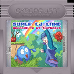
Dumblador revisit post from October 2011 featured not-so-great book covers and "colour balance" post 20 days later featured them almost identical. Then 10 more days and they suddenly look like in School Rush.
What happened in between ? pixel art Comment and Critique. "I think you're focusing way too much on using techniques right rather than the objects itself" said Elk, but I couldn't figure out what that meant. "The biggest problem with your art is bad texturing, at this point, I'll return with specific edit and critique."
So Helm Returns is what happened.

1. is your book.
2. is the form broken down to its block shape.
3. is geometry, lit from above more or less. If a thing doesn't look good and identifiable on this stage, it won't look much better if you overrender it.
4. here I apply more detailed geometry, I still don't need more colors or fancy tricks, I don't need to fake texture, it's just stuff that the book can support. I also looked at reference here which you should always do, no matter how cartoony what you're trying to draw is. You can spot many differences from 3 to 4 that are related to the reference.
5.After the shapes are good, identifiable and the object has volume, you can go nuts with your new school colors and tints and whatever else, it's all embellishment from here and on.
So I went on and try to apply the master's suggestions to get closer to what I wanted:
My attempt at having the right geometry with flat shading and minimal details, my step of putting more detailed geometry and shading before adding any texture, and the final take. The page lines have become too horizontal and dull, retrospectively, but the binding has been used almost as-is in the game.
It was a pleasure to read the master's comment:
Much, much better. Wouldn't surprise me to see this piece in any professional good looking mega drive game of the era.
Approach all real-life related items you render in a similar way, avoid 'noisy textures' for their own sakes and you will level up in your craft."
A lesson to remember as I'll have to work on more pixels for the upcoming game...


 Vote for your favourite post


1 comment:
glad to have had a positive influence my friend
Post a Comment